Events
Power BI DataViz World Championships
Feb 14, 4 PM - Mar 31, 4 PM
With 4 chances to enter, you could win a conference package and make it to the LIVE Grand Finale in Las Vegas
Learn moreThis browser is no longer supported.
Upgrade to Microsoft Edge to take advantage of the latest features, security updates, and technical support.
APPLIES TO: ![]() Power BI service for business users
Power BI service for business users ![]() Power BI service for designers & developers
Power BI service for designers & developers ![]() Power BI Desktop
Power BI Desktop
A Power BI report is a multi-perspective view into a semantic model, with visuals that represent findings and insights from that semantic model. A report can have a single visual or many pages full of visuals. Depending on your job role, you might be someone who designs reports, or you might be a business user who consumes reports. This article is for business users.

A. This report has six pages (or tabs). The example shows the Sentiment page.
B. This page has five visuals and a page title.
C. The Filters pane shows all applied filters. To collapse the Filters pane, select the arrow (>).
D. The Power BI banner shows the title of the report and the sensitivity label. Select the title to open a menu that shows the report location, date it was last updated, and contact information for the report creator.
E. The action bar contains links to numerous actions you can take on this report. Some actions require extra permissions. For example, based on your permissions you may be able to edit, subscribe, and share the report. All users can add a comment, view a bookmark, or generate automatic insights. Select More options (...) to see the full list of report actions.
If you're new to Power BI, read Basic concepts for the Power BI service business users to get a good foundation. You can view, share, and annotate reports on mobile devices. For more information, see Explore reports in the Power BI mobile apps.
Power BI bases a report on a single semantic model. Report designers create the visuals in a report to represent pieces of information. Presenting data as visuals makes it easier to grasp the meaning of what you're seeing. And, the visuals aren't static. They update as the underlying data changes. The designers do the pre-work, adding visuals that they believe are interesting. But you get to explore and dig deeper. You interact with the visuals and filters as you dig into the data to discover insights and find answers. The extent of what you can do with a report depends on your role and the permissions the report designer assigns to you.
As you explore and interact with your content by filtering, slicing, subscribing, and exporting, you can't corrupt the reports. Your work doesn't affect the underlying semantic model or the original shared dashboards, reports, and apps.
Note
You can't damage your data. The Power BI service is a great place for you to explore and experiment without worrying about breaking something.
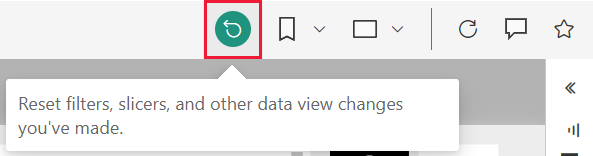
Your changes don't affect underlying data, but that doesn't mean you can't save your changes. You can, but those changes only affect your view of the content. To revert to the default view of the report, select the Reset icon.
Dashboards can be confused with reports because they're both canvases filled with visualizations. But there are major differences. The following table shows an overview of the different capabilities of dashboards and reports:
| Capability | Dashboards | Reports |
|---|---|---|
| Pages | One page | One or more pages |
| Data sources | One or more report or semantic model per dashboard | A single semantic model per report |
| Filtering | No, you can't filter or slice | Yes, there are many ways to filter, highlight, and slice |
| Can see underlying semantic model tables and fields | No. Can export data but can't see the semantic model tables and fields in the dashboard itself | Yes. Can see semantic model tables and fields and values that you have permissions to see |
| Customization | No | Yes, depending on your permissions you can cross-filter, change visual type, apply design features, add bookmarks and comments, generate QR codes, analyze in Excel, and much more |
| Pinning | Can pin existing visuals (tiles) only from current dashboard to your other dashboards | Can pin visuals (as tiles) and entire report pages to any of your dashboards |
Depending on your role, you may be a designer, someone who creates reports for your own use or to share with colleagues. You want to learn how to create and share reports.
Or you might be a business user, someone who receives reports from others. You want to learn how to understand and interact with the reports. If you're a report business user, these links are for you:
Tip
If you didn't find what you're looking for here, use the table of contents on this page to browse more articles.
Events
Power BI DataViz World Championships
Feb 14, 4 PM - Mar 31, 4 PM
With 4 chances to enter, you could win a conference package and make it to the LIVE Grand Finale in Las Vegas
Learn moreTraining
Module
Create and share your first Power BI report - Training
With Power BI, you can create compelling visuals and reports. In this module, you learn how to use Power BI Desktop to connect to data, build visuals, and create a report that you can share with others in your organization. You then learn how to publish the report to the Power BI service, so that others can see your insights and benefit from your work.
Certification
Microsoft Certified: Power BI Data Analyst Associate - Certifications
Demonstrate methods and best practices that align with business and technical requirements for modeling, visualizing, and analyzing data with Microsoft Power BI.