I asked about rendering dark mode checkboxes recently here on Microsoft Q & A. An elegant solution was provided via the custom draw concept:
#pragma warning(disable: 26429)
	bool CDarkModeBase::OnNotify(
		_In_ const CWnd* pParentWnd,
		_In_ LPARAM lParam,
		_Outptr_ LRESULT* pResult,
		_In_ bool isChildDialog /*= false*/)
	{
		if (!DarkModeTools::InvokeUseDarkModeFunction())
			return false;

		NMHDR* pNMHDR = reinterpret_cast<NMHDR*>(lParam);
		if (pNMHDR->code == NM_CUSTOMDRAW)
		{
			LPNMCUSTOMDRAW pNMCD = reinterpret_cast<LPNMCUSTOMDRAW>(pNMHDR);
			*pResult = CDRF_DODEFAULT;

			if (pNMCD->dwDrawStage == CDDS_PREPAINT)
			{
				if (!pParentWnd)
					return false;

#pragma warning(disable: 26462 26472)
				const auto pControl = pParentWnd->GetDlgItem(static_cast<int>(pNMHDR->idFrom));
				if (pControl)
				{
					CString className;
					GetClassName(pControl->GetSafeHwnd(), className.GetBuffer(256), 256);
					className.ReleaseBuffer();

					if (className == L"Button")
					{
						const CButton* pButton = reinterpret_cast<CButton*>(pControl);
						if (pButton)
						{
							const auto buttonStyle = pButton->GetStyle();
							if ((buttonStyle & BS_CHECKBOX) == BS_CHECKBOX ||
								(buttonStyle & BS_AUTOCHECKBOX) == BS_AUTOCHECKBOX ||
								(buttonStyle & BS_RADIOBUTTON) == BS_RADIOBUTTON ||
								(buttonStyle & BS_AUTORADIOBUTTON) == BS_AUTORADIOBUTTON)
							{
								const bool isAlignedTop = (buttonStyle & BS_TOP) == BS_TOP;
								const bool  isAlignedVCenter = (buttonStyle & BS_VCENTER) == BS_VCENTER;
								const bool isAlignedBottom = (buttonStyle & BS_BOTTOM) == BS_BOTTOM;
								const bool isAlignedLeft = (buttonStyle & BS_LEFT) == BS_LEFT;
								const bool isAlignedRight = (buttonStyle & BS_RIGHT) == BS_RIGHT;
								const bool isLeftText = (buttonStyle & BS_LEFTTEXT) == BS_LEFTTEXT;

								CDC* pDC = CDC::FromHandle(pNMCD->hdc);
								if (pDC)
								{
									// Save original text color and background mode
									const auto oldBkMode = pDC->SetBkMode(TRANSPARENT);
									const auto oldTextColor = pDC->GetTextColor();

									// Set text color based on control state
									if (!pControl->IsWindowEnabled())
									{
										pDC->SetTextColor(GetSysColor(COLOR_GRAYTEXT));
									}
									else
									{
										pDC->SetTextColor(DarkModeTools::kDarkTextColor);
									}

									// Get checkbox size
									CSize sizeCheckBox(16, 16); // Default size
									HTHEME hTheme = OpenThemeData(nullptr, L"Button");
									if (hTheme)
									{
										GetThemePartSize(hTheme, pNMCD->hdc,
											BP_CHECKBOX, CBS_UNCHECKEDNORMAL, nullptr, TS_DRAW, &sizeCheckBox);
										CloseThemeData(hTheme);
									}

									// Compute horizontal shift
									CSize sizeExtent;
									GetTextExtentPoint32(pNMCD->hdc, L"0", 1, &sizeExtent);
									const int nShift = sizeExtent.cx / 2;

									// Adjust text rectangle
									CRect rc(pNMCD->rc);

									if (isLeftText)
									{
										// Shift text to the left of the checkbox
										rc.right -= (sizeCheckBox.cx + nShift);
									}
									else if (isAlignedRight)
									{
										// Subtract checkbox width from the right edge
										rc.right -= sizeCheckBox.cx + nShift;
									}
									else
									{
										// Add checkbox width to the left edge (default behavior)
										rc.OffsetRect(sizeCheckBox.cx + nShift, 0);
									}

									// Get text
									CString strText;
									pControl->GetWindowText(strText);

									// Measure text height
									CRect rcMeasure(rc);
									pDC->DrawText(strText, &rcMeasure, DT_LEFT | DT_WORDBREAK | DT_EDITCONTROL | DT_CALCRECT);

									// Center text vertically based on alignment
									const auto textHeight = rcMeasure.Height();
									int verticalOffset = 0;  // Default to no offset

									if (isAlignedTop)
									{
										verticalOffset = 0; // No adjustment needed
									}
									else if (isAlignedBottom)
									{
										verticalOffset = rc.Height() - textHeight;
									}
									else
									{
										verticalOffset = (rc.Height() - textHeight) / 2;
									}

									rc.top += verticalOffset;
									rc.bottom = rc.top + textHeight;

									// Draw text with appropriate alignment
									UINT textFormat = DT_WORDBREAK | DT_EDITCONTROL | DT_EXPANDTABS | DT_END_ELLIPSIS;
									if (isAlignedRight)
									{
										textFormat |= DT_RIGHT; // Align text to the right
									}
									else
									{
										textFormat |= DT_LEFT; // Align text to the left
									}

									// Draw text
									pDC->DrawText(strText, &rc, textFormat);

									// Restore original properties
									pDC->SetBkMode(oldBkMode);
									pDC->SetTextColor(oldTextColor);

									*pResult = CDRF_SKIPDEFAULT;
									return true;
								}
							}
						}
					}
					else if (className == L"msctls_trackbar32")
					{
						// Request notifications for individual items.
						*pResult = CDRF_NOTIFYITEMDRAW;
						return true;
					}
				}
			}
			else if (pNMCD->dwDrawStage == CDDS_ITEMPREPAINT)
			{
				// Check if the item is the channel area.
				if (pNMCD->dwItemSpec == TBCD_CHANNEL)
				{
					// Set the background color.
					HBRUSH hBrush = CreateSolidBrush(DarkModeTools::kDarkSliderChannelColor);
					FillRect(pNMCD->hdc, &pNMCD->rc, hBrush);
					DeleteObject(hBrush);

					// Return CDRF_SKIPDEFAULT to prevent default drawing.
					*pResult = CDRF_SKIPDEFAULT;
					return true;
				}
			}
		}
		return false;
	}
It works great in the majority of situations. But I have noticed some minor differences.
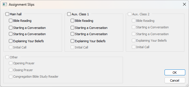
Take this light theme dialog, which uses native GUI rendering:
Now take a look at the same dialog, using the custom drawn checkboxes in dark mode:
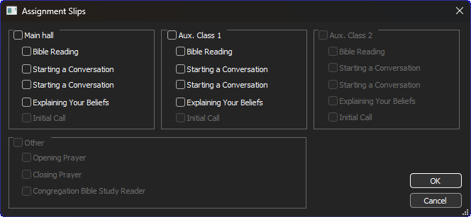
They are virtually identical, except for the check boxes that should be more centrally aligned over the group boxes. See?
This is how those checkboxes are placed in the Resource Editor:
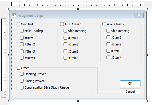
This is the same dialog extracted from the RC file:
IDD_DIALOG_SELECT_SLIPS DIALOGEX 0, 0, 309, 169
STYLE DS_SETFONT | DS_FIXEDSYS | WS_POPUP | WS_CAPTION | WS_SYSMENU | WS_THICKFRAME
CAPTION "Assignment Slips"
FONT 8, "MS Shell Dlg", 0, 0, 0x1
BEGIN
    GROUPBOX        "",IDC_STATIC_MH,7,7,94,87
    CONTROL         "Main hall",IDC_CHECK_MH,"Button",BS_AUTO3STATE | WS_TABSTOP,12,7,43,10
    CONTROL         "Bible Reading",IDC_CHECK_MH_BR,"Button",BS_AUTOCHECKBOX | WS_TABSTOP,20,21,73,10
    CONTROL         "#Item1",IDC_CHECK_MH_ITEM1,"Button",BS_AUTOCHECKBOX | WS_TABSTOP,20,36,73,10
    CONTROL         "#Item2",IDC_CHECK_MH_ITEM2,"Button",BS_AUTOCHECKBOX | WS_TABSTOP,20,50,73,10
    CONTROL         "#Item3",IDC_CHECK_MH_ITEM3,"Button",BS_AUTOCHECKBOX | WS_TABSTOP,20,65,73,10
    CONTROL         "#Item4",IDC_CHECK_MH_ITEM4,"Button",BS_AUTOCHECKBOX | WS_TABSTOP,20,79,73,10
    GROUPBOX        "",IDC_STATIC_AUX1,107,7,94,87
    CONTROL         "Aux. Class 1",IDC_CHECK_AUX1,"Button",BS_AUTO3STATE | WS_TABSTOP,113,7,56,10
    CONTROL         "Bible Reading",IDC_CHECK_AUX1_BR,"Button",BS_AUTOCHECKBOX | WS_TABSTOP,121,21,73,10
    CONTROL         "#Item1",IDC_CHECK_AUX1_ITEM1,"Button",BS_AUTOCHECKBOX | WS_TABSTOP,121,36,73,10
    CONTROL         "#Item2",IDC_CHECK_AUX1_ITEM2,"Button",BS_AUTOCHECKBOX | WS_TABSTOP,121,50,73,10
    CONTROL         "#Item3",IDC_CHECK_AUX1_ITEM3,"Button",BS_AUTOCHECKBOX | WS_TABSTOP,121,65,73,10
    CONTROL         "#Item4",IDC_CHECK_AUX1_ITEM4,"Button",BS_AUTOCHECKBOX | WS_TABSTOP,121,79,73,10
    GROUPBOX        "",IDC_STATIC_AUX2,207,7,94,87
    CONTROL         "Aux. Class 2",IDC_CHECK_AUX2,"Button",BS_AUTO3STATE | WS_TABSTOP,212,7,56,10
    CONTROL         "Bible Reading",IDC_CHECK_AUX2_BR,"Button",BS_AUTOCHECKBOX | WS_TABSTOP,221,21,73,10
    CONTROL         "#Item1",IDC_CHECK_AUX2_ITEM1,"Button",BS_AUTOCHECKBOX | WS_TABSTOP,221,35,73,10
    CONTROL         "#Item2",IDC_CHECK_AUX2_ITEM2,"Button",BS_AUTOCHECKBOX | WS_TABSTOP,221,50,73,10
    CONTROL         "#Item3",IDC_CHECK_AUX2_ITEM3,"Button",BS_AUTOCHECKBOX | WS_TABSTOP,221,64,73,10
    CONTROL         "#Item4",IDC_CHECK_AUX2_ITEM4,"Button",BS_AUTOCHECKBOX | WS_TABSTOP,221,78,73,10
    GROUPBOX        "",IDC_STATIC_OTHER,7,100,193,62
    CONTROL         "Other",IDC_CHECK_OTHER,"Button",BS_AUTO3STATE | WS_TABSTOP,12,100,35,10
    CONTROL         "Opening Prayer",IDC_CHECK_OTHER_PRAYER_OPEN,"Button",BS_AUTOCHECKBOX | WS_TABSTOP,20,113,175,10
    CONTROL         "Closing Prayer",IDC_CHECK_OTHER_PRAYER_CLOSE,"Button",BS_AUTOCHECKBOX | WS_TABSTOP,20,128,175,10
    CONTROL         "Congregation Bible Study Reader",IDC_CHECK_OTHER_CBS_READER,
                    "Button",BS_AUTOCHECKBOX | BS_TOP | BS_MULTILINE | WS_TABSTOP,20,143,175,12
    DEFPUSHBUTTON   "OK",IDOK,252,131,50,14
    PUSHBUTTON      "Cancel",IDCANCEL,252,148,50,14
END
' cx='32' cy='32' r='32' /%3E%3Ctext x='50%25' y='55%25' dominant-baseline='middle' text-anchor='middle' fill='%23FFF' %3EC%3C/text%3E%3C/svg%3E)