How to Get Horizontal Bar Graph to Realign with Data

Samuel Wolfe 0 Reputation points
2025-03-12T16:08:50.59+00:00

Hello,

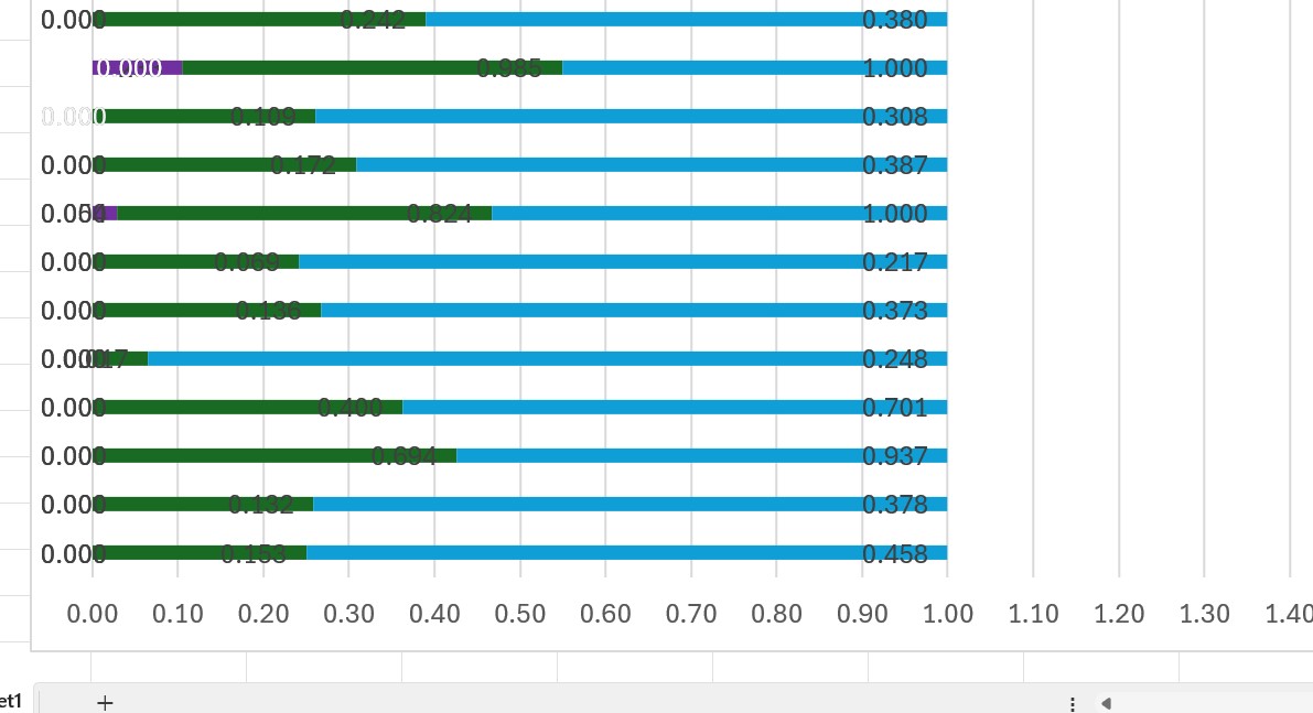
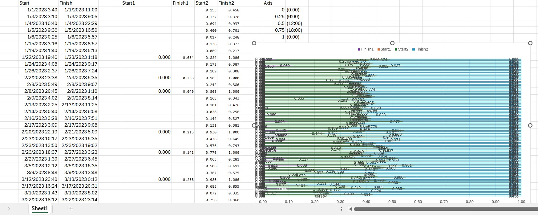
I am trying to display data on a horizontal bar graph showing surgery duration and times, I have each time labeled as "start 2" and "finish 2" for the starting and finishing times, expressed in number format (1 being 24 hours, or 0:00, 0.5 being 12 noon). I also have "start 1" and "finish 1" for overlapping times that continued beyond midnight, in order to display surgical times restarting at 0:00 on the left side of the graph (the graph axis moved from midnight to midnight). The following pictures should clarify.

My problem is that the times, as seen in the pictures (bars are labeled with their correct corresponding value, for clarity), is that the values for each bar (which are correctly labeled) do not line up with the x-axis. So, for example, 0.4 is shown on the graph more around 0.35, and "1" will go off the graph and end about at 2.8 or so. Can someone please clarify how to get the data to just line up with the x-axis?

Other context: this is a 100% stacked bar chart.

I have tried:

  • manually setting the axis minimum and maximum values
  • changing the axis to display values in reverse order
  • adjusting the bar width
  • ensuring data is mapped to the correct axis ("primary axis")
  • ensuring the number format of the cells the data is coming from is "number" instead of "text."

Screenshot 2025-03-12 114808

Screenshot 2025-03-12 120413

Screenshot 2025-03-12 120520

Screenshot 2025-03-12 120607

Screenshot 2025-03-12 120727

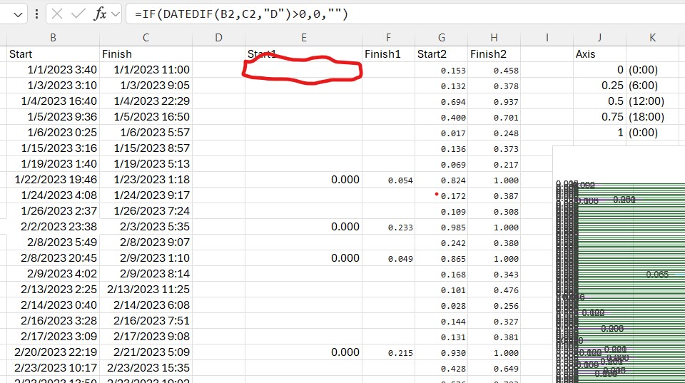
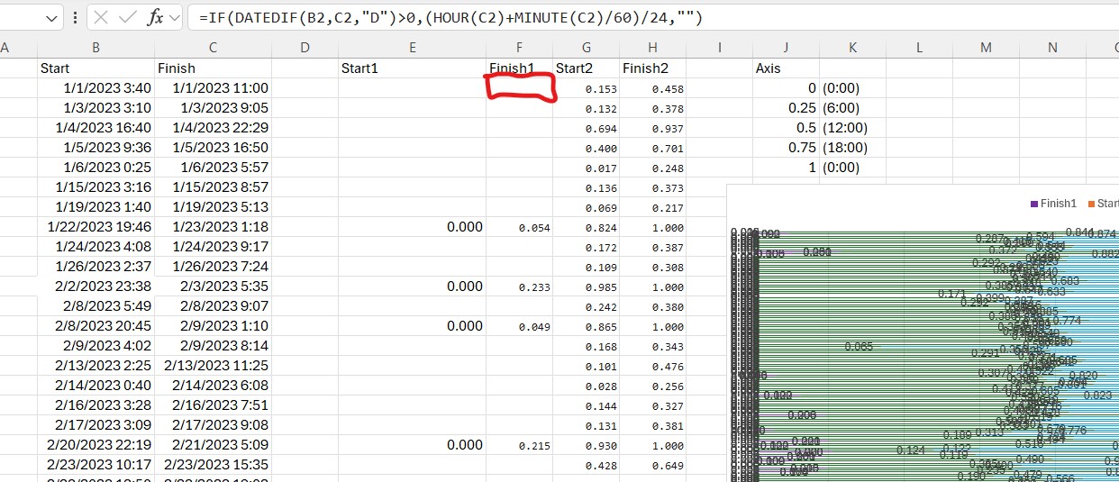
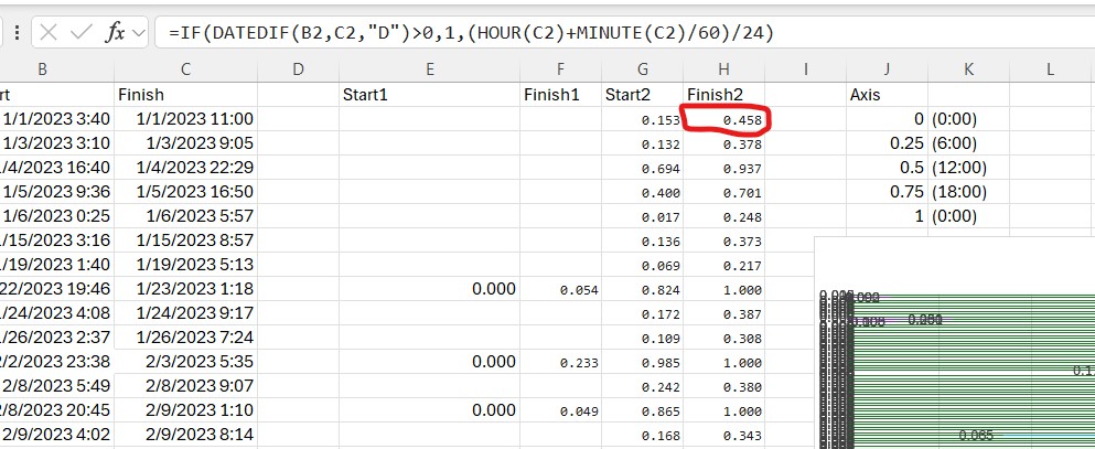
Also included among these pictures are the formulas I used, just for context (don't worry about it).

If this works correctly, the blue bars, "finish 2" should not all move out to "1," instead, most should stop before reaching 1 because their values are, as indicated, less than 1.

Excel Management
Excel Management
Excel: A family of Microsoft spreadsheet software with tools for analyzing, charting, and communicating data.Management: The act or process of organizing, handling, directing or controlling something.
1,809 questions
0 comments No comments
{count} votes

2 answers

Sort by: Most helpful
  1. Jiajing Hua-MFST 16,110 Reputation points Microsoft External Staff
    2025-03-13T07:30:16.63+00:00

    Hi,

    I suggest you use Clustered Bar chart.

    User's image

    For example, if you add the "Start 2“and "Finish 2” 2 series, then you will get following chart.

    User's image

    The Finish2 bar is longer than Start2, if Finish2 is located on top of Start2, please right click on chart > Select Data > Reverse their order, click OK.

    User's image

    Right click on one bar > Format Data Series > Series Overlap: 100%. By the way, please change the Bounds values of X-axis.User's image

    And then, you will get following chart.

    enter image description here

    Please set the Start2 bar to white fill color and no border line.

    enter image description here

    Then please add the just Finish1 Series in chart via right clicking chart > Select Data > Add, add the data source. But you do not need add Start1, because the Start1 starts with 0:00.

    enter image description here


    If the answer is helpful, please click "Accept Answer" and kindly upvote it. If you have extra questions about this answer, please click "Comment". Note: Please follow the steps in our documentation to enable e-mail notifications if you want to receive the related email notification for this thread.


  2. riny 430 Reputation points
    2025-03-13T07:31:58.1+00:00

    I presume this is a follow-up question on https://learn.microsoft.com/en-us/answers/questions/2223399/how-to-display-time-duration-on-a-horizontal-bar-g

    Don't really understand why you are now using a 100% stacked bar chart as that will indeed plot stacked bars from 0 to 1 (that is 0% to 100%). So if you have values like 0.15 and 0.45 these will be plotted as 25% [ 0.15 / (0.15+0.45) ] and 75% [ 0.45 / (0.15+0.45) ] for a total of 100%. That's how such charts work. You should use a regular stacked bar chart instead and you have two solutions in the linked thread.


Your answer

Answers can be marked as Accepted Answers by the question author, which helps users to know the answer solved the author's problem.